
Home / Analysis and Tools / Duck Curve Charts

Duck Curve Charts

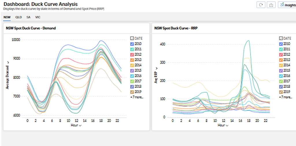
These charts illustrate the average demand for electricity at any given time of day for the last decade. Navigate through them to understand the impact of solar energy on demand.

Stay Ahead of the Energy Market

Subscribe To Our Newsletter for Energy Updates

Sign up to be informed about wholesale electricity price changes, energy news, tips to save your business money, and much more, delivered straight to your inbox.

Name

Are you ready to save on business energy costs?

Our consultants are ready to help you navigate the complex energy market.

Privacy Overview

This website uses cookies so that we can provide you with the best user experience possible. Cookie information is stored in your browser and performs functions such as recognising you when you return to our website and helping our team to understand which sections of the website you find most interesting and useful.